By Olivia Wang | November 19, 2020
We used Safegraph data, which is voluntary cellphone location data, to analyze foot traffic to six types of points of interest (POI) in North Carolina: grocery stores, healthcare facilities, offices, parks, recreational POIs, and restaurants and bars.
The sampling of cellphones is dynamic, meaning that the sample size changes during a given period. However, several factors help to make the data reliable. North Carolina’s sample, the raw number of cellphones included in Safegraph’s dataset at a given time, is well-balanced, because Safegraph combs its data to ensure demographic representativeness.
Where are people going?
We analyzed grocery stores, health care, offices, parks, recreation, and restaurants & bars because these are the common foot traffic destinations that are tracked by Safegraph’s activity data.
We normalized the weekly foot traffic by the total number of devices sampled each week in North Carolina. Then, we calculated the percent change in weekly visits per device compared to the baseline. The baseline is the weekly foot traffic to each type of POI in the week starting on January 6, 2020. As an example, the baseline rate of weekly foot traffic to grocery stores is 0.57 visits per device, and the rate is 0.64 visits per device in the week starting March 16, 2020. The Y-axis value for the week starting on March 16, 2020, is (0.64-0.57)/0.57=12.3%, representing that the frequency to visit grocery stores increased by 12.3%.
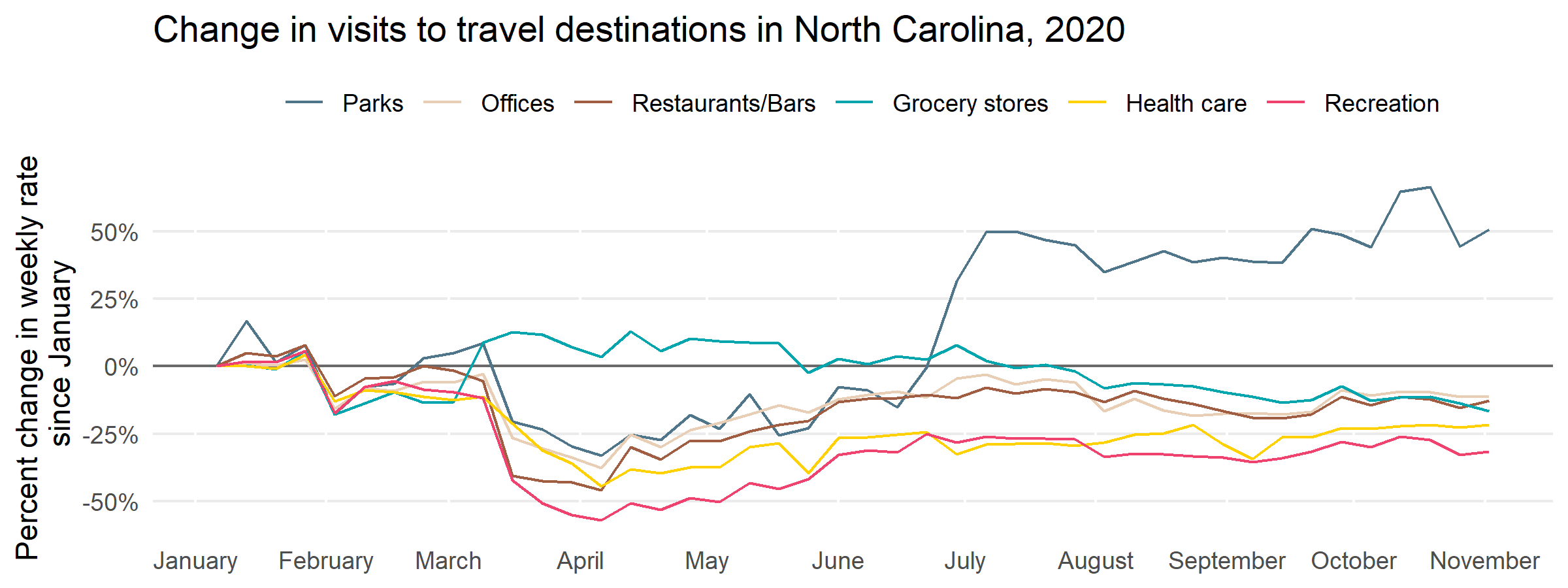
Foot traffic to five of six POI types, immediately dropped following NC’s State of Emergency declaration on March 10. When an executive stay-at-home order was issued on March 30, 2020, and social distancing was becoming increasingly enforced across the state, these numbers plummeted. Recreational destinations decreased by 60%, and visits to offices, restaurants, and bars, and healthcare facilities dropped by about 40%. Visits to parks dropped by about 30%. After the stay-at-home order was lifted and the State shifted to Phase 2 in late May, foot traffic to these five types of destinations recovered, but not evenly.
Visits to offices are at levels similar to the start of the pandemic (the week of January 6, 2020) and visits to restaurants and bars, while still 10% lower than the start of the pandemic, increased significantly. Visits to recreational places and healthcare facilities were still 20% less compared to the baseline. Visits to parks were 40% higher than the baseline. Some of that increase could be due to seasonality. Even considering the easing of stay-at-home orders in late spring, people are far more likely to visit a park in the spring and summer than in winter.
Foot traffic to grocery stores has been an exception to the common pattern of the other five POI categories. As essential businesses for people’s daily lives, grocery stores were still operating despite stay-at-home orders. Foot traffic to grocery stores was comparatively stable throughout the pandemic. In early March, weekly foot traffic to grocery stores increased slightly before dipping back to their normal level around late March.
Share of visits to POIs: How have they changed?
We can also identify important insights by examining the share of foot traffic to each type of POI (also using the January 6, 2020 baseline). We normalized the foot traffic of each type of POI by the total foot traffic for all types of POI in North Carolina. Then, we calculated the change in the share of foot traffic compared to the baseline week (January 6, 2020).
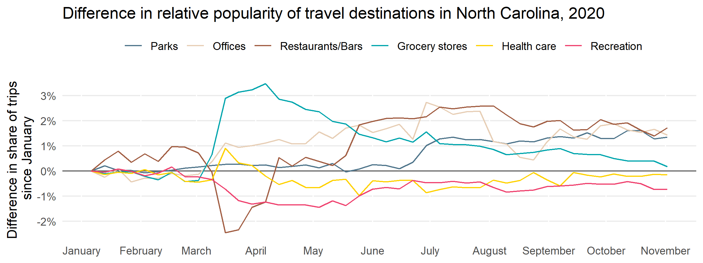
Here, we see some divergence in the six types of POI. The share of visits to grocery stores increased by about 3% in early March and was still 1% higher in November compared to the baseline. In early March, the share of visits to healthcare facilities increased by 1% but soon returned to pre-pandemic levels. The share of foot traffic to offices remained 1% higher after early March. The share of visits to recreational destinations and restaurants and bars dropped significantly by about 1% and 2% respectively. However, the share of visits to restaurants and bars returned to baseline levels in April and even increased by 2% in late May. Meanwhile, visits to recreational destinations hovered at a rate 1% lower than the baseline. The share of visits to parks was very stable until mid-June and then increased 1% by November.
While there are some observable differences in the share of visits to different POIs, these changes were relatively small. One reasonable inference we can draw from this is that people are attempting to return to their typical patterns of daily life, but are encountering obstacles in doing so, leading to minor changes in foot traffic patterns.
Understanding the importance of POIs during the pandemic
Our findings also suggest that researchers and policymakers need to investigate the foot traffic patterns of different places that North Carolinians visit throughout their daily routines. Some places, such as restaurants, have had to change their mode of operation during the pandemic in order to ensure the safety of their customers, while also grappling with economic hardship. But other points of interest, such as grocery stores, have seen increased foot traffic at critical moments, and the general public has returned to their pre-pandemic foot traffic patterns regarding offices, parks, and other types of POIs.
The straightforward takeaways from the Safegraph foot traffic data, such as grocery stores’ increased share of total foot traffic, could be important for policymakers and researchers to incorporate into decisions about public health policy. It is also important to reiterate that the Safegraph data examines the ratio of tracked devices to grocery store trips. People who are not included in this dataset - such as people who do not carry their cellphones with them, or opt out of data collection - may be facing mobility issues that are not reflected in the dataset. We know that geographic location has had an impact on vehicle travel during the pandemic, in addition to the dynamics we can see in the Safegraph activity data. Interactions between vehicle and foot traffic are one potential area for future investigation, as well as questions about how different demographic groups have seen their foot traffic patterns alter throughout the pandemic.
